
By The International Dark-Sky Association
Part 1 - Eyes In The Sky: Exploring Global Light Pollution With Saterllite Maps
The virtual flood of data produced by the DMSP satellites and Suomi NPP is now available to the public. Here are are some websites where you can see the images for yourself.
The Blue Marble
This site takes both DMSP and VIIRS images and overlays them on an interactive Google Maps that allows users to pan around Earth, and zoom in and out on particular areas of interest. A map for each year from 2008 to 2015 is available, with the exception of 2011. Comparison of different years shows how the amount of light at any particular place on Earth is changing. The figure below, showing the eastern Mediterranean Sea region (top row) and a zoom on the area southwest of London, UK (bottom row), illustrates how the resolution of the images improved significantly after VIIRS data became available in 2012.
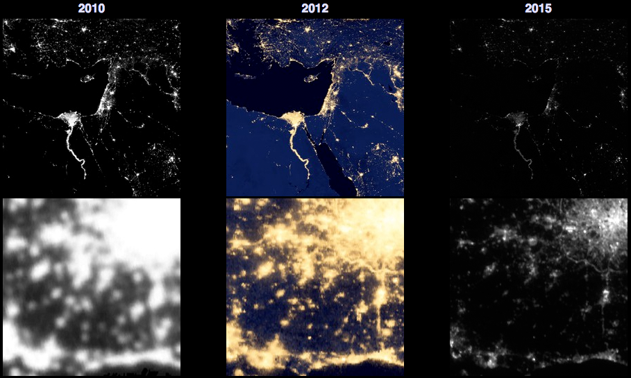
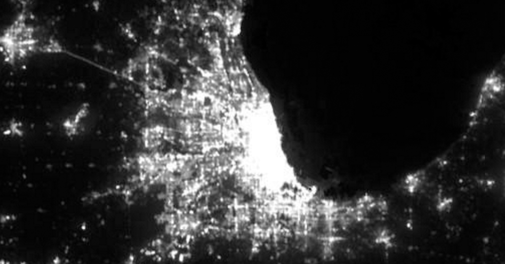
Note that even though the 2012 and 2015 maps are from the same source, they look very different. Images from 2012 are presented in a way that emphasizes faint light in rural areas at the expense of the city cores, which are bright and featureless. Images from the 2013-15 maps, in comparison, are scaled in a way that accurately reflects the large differences in brightness within cities, but can make rural areas appear especially dark. In the image below, spanning about 250 kilometers and centered on the U.S. city of Chicago, shows the nighttime light from the Chicago metropolitan area resolved into individual cities and suburbs.
Interested readers can get the latest VIIRS data directly through NOAA’s website. Both daily and monthly average images are available. Be aware, however, that these are very large files!
Jurij Stare, of Slovenia, created a website like the Blue Marble, but with an added feature: the light maps are calibrated in real units, allowing users to make simple (but quantitative) comparisons of the amount of upward-directed light in different parts of the world. His website overlays DMSP and VIIRS images on top of an interactive Bing Map. The example below shows northwestern Europe, which contains some of the most light-polluted territories in the world, along with a scale (right) that shows the meaning of the colors on a scale of physical units.
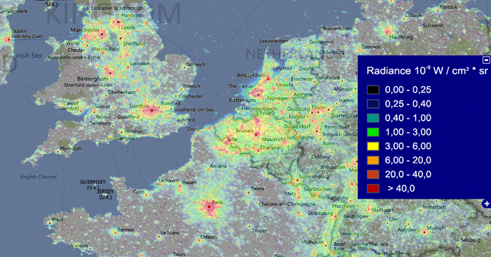
The color scale on this map is especially useful in assessing the amount of light projected from cities into rural areas.
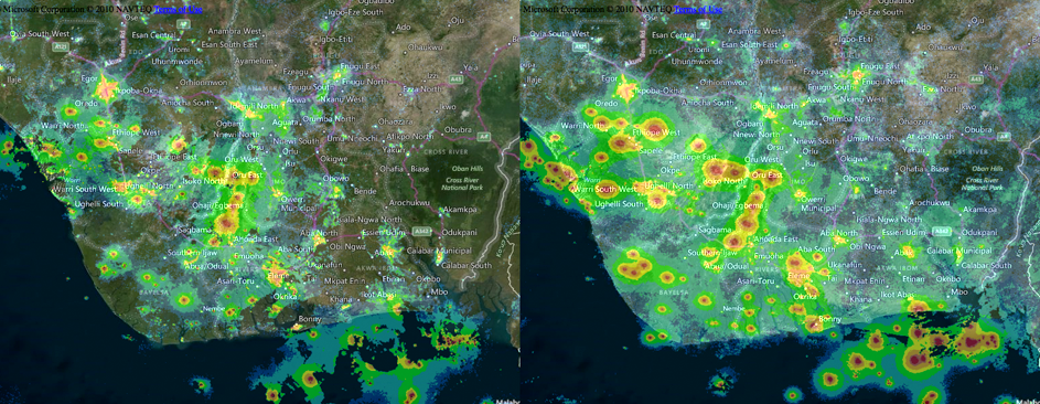
The real power of the Blue Marble and Lightpollution.info maps is in the ability to look at regions of the Earth over time to see whether the amount of light leaving the ground is changing for better — or worse. This image compares VIIRS images of the Niger River delta in southern Nigeria in 2012 (left) and 2015 (right). The dramatic increase in light between these two years is due to increased extraction of petroleum in this region, now in excess of 2 million barrels of oil per day.
Lastly, there is an addition source of images of the Earth’s nighttime lights: astronauts aboard the International Space Station. Using digital SLR cameras and an Earth-tracking mount, astronauts have amassed thousands of such images.
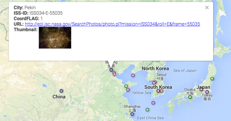
The Cities At Night project aims to crowdsource the identification of cities in the images. The targets of many of the astronauts’ images are unknown, because position information recorded for the Space Station only refers to the point on the Earth exactly below its flight path, while astronauts’ images are most often taken in directions looking away from the path. Cities At Night relies on users’ familiarity with their own cities to recognize the patterns of roads and other lit structures appearing in the images. Identified images are presented on a Google Maps base with markers pointing at the original images. The example below shows an identified image of Beijing, China.
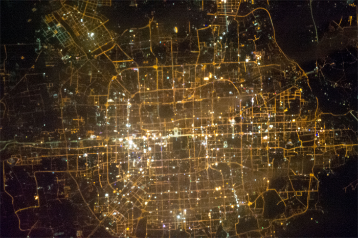
Because of the low orbit of the Space Station — averaging about 410 kilometers above the Earth’s surface — astronaut images of cities have the highest resolution of all. They show roads, airports, even individual lit buildings. They also tell us how the colors of cities at night are changing. These two images are of the Italian city of Milan, taken from aboard the International Space Station in 2012 (left) and 2015 (right).
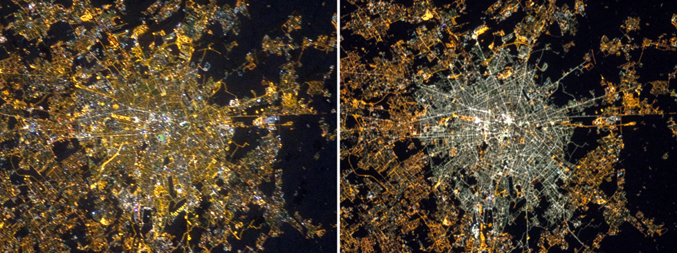
The city center became noticeably more blue in the interim after the Milan converted much of its municipally-owned lighting from low-pressure sodium vapor lamps to white LED lamps. Other instruments, like VIIRS, are also sensing these changes. Note, however, that VIIRS isn’t especially sensitive to the extra blue light emitted by new white LED street lighting systems, so cities that have made the switch to LED (such as Milan) appear to have become darker in recent years, although they probably did not.
What other interesting piece of information about our planet (and its inhabitants) lie waiting to be discovered in images of Earth at night from orbit? Have a look for yourself!
This article has also been published on IDA website.