GAM 2019 Blog
by Lindsay Bartolone
- Published: Wednesday, April 24 2019 03:39
Since the mid-20th century, America’s space program has been studying the Moon using robotic, orbiting and human explorers. Once scientists have carefully collected information, they need a way to share and display the new knowledge. Often the information is complex and usually invisible to our eyes either because it is too small or far away. Sometimes, the information like temperature is just something our eyes cannot see. So, scientists use a technique called "representational color". You see representational color all the time. Weather maps that show temperature are an example of representational color. The “warmer colors” (red, orange, yellow) represent warmer temperatures and “colder colors” (green, blue, purple) represent colder temperatures. The scientist who constructs the graphic is a bit of an artist, as they choose the colors to represent the information they are trying to share.
This is especially true of astronomers who often collect information in the form of invisible light, along with visible light. The detectors which scientists use to collect images from space “see” in one specific “color” or energy of light at a time and count the amount of color that they see in each piece or pixel of the picture. If the color of light the detector is designed to record is a color we can see with our eyes, then the scientist often uses that color when they display the image. If the color of the light is an energy we cannot see with our eyes, then the scientist has to pick a color we can see, to represent the information. If the invisible color has more energy than blue visible light, the scientist might pick purple to represent the invisible light. Each time the scientist chooses a new color to represent the information, they create a label to let other people know what the color represents in the picture.
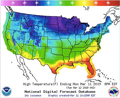
Figure 1
Here is a picture of a weather map (Figure 1.) Notice the scale on the top. Red colors indicate temperatures of 80-90° F. Purple colors represent colors temperatures of 20-30°F. While these colors are commonly used in this way, the scientist could have chosen other colors or a range of just one color to represent the same information. Notice the edited version of the map with the new color scale (Figure 2.) Neither of these maps represents what the United States actually looks like to our eyes, but it does tell us information about temperature.
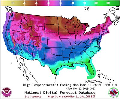
Figure 2
Visit https://svs.gsfc.nasa.gov/3582 to see how color is used to show elevation on the Moon. Sometimes, people call this use of color “false” color because the colors are different from what we see with our eyes. However, since the colors do represent real scientific information, the term “representational color” is preferred.
Visit https://viewspace.org/resources/invisible_universe to explore astronomical images that use representational color to combine views of visible and invisible light.
View the “In a Different Light” video here: https://viewspace.org/resources/videos to learn even more about how colors can help use invisible light from the Crab Nebula to better understand what is going on inside a beautiful space object.
Stay tuned: Astronomers Without Borders will launch an activity soon where you can be a scientist and science artist too. Check back later this year for links to our Moon Coloring Activity.
|
Lindsay Bartolone is a Science Education Consultant from Chicago IL, and serves as Astronomers Without Borders’s Director of Education. She has been a Co-I on NASA's Science Education and Public Outreach Forum projects in the areas of Astrophysics and Heliophysics. She has led Education and Public Outreach Programs for NASA missions, including Interstellar Boundary Explorer (IBEX) and Wilkinson Microwave Anisotropy Probe (WMAP). She has also served as Director of Education at Adler Planetarium. |
 |

