W. Scott Kardel
We've all seen examples of good and bad lighting, but every once in a while there’s an example of lighting that is extremely bad. I present to you four examples of the some of the worst of the worst in outdoor lighting.
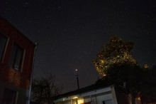
In the United States many people are very patriotic and somewhat obsessive about displaying and illuminating the U.S. flag. Sometimes that sense of patriotism gets a bit carried away. Take for example this flag on display (left) outside of a fire station in California.
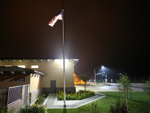
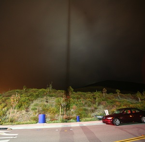
The fire station won an award for being an environmentally sustainable building, but apparently outdoor lighting wasn’t part of the award. Note the photo on the right showing that the light is so bright you can see the shadow of the flag in the sky! There’s nothing environmentally friendly about that, is there?
 If a little light is necessary for safety, will more lighting make us even safer? Not necessarily. Sometimes too much is just too much.
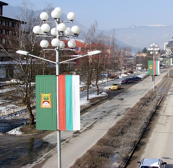
This photo, taken by Andrej Mohar, of streetlights in Bulgaria, is an example of streetlights gone wild. Each pole along this street has two nearly downward pointing lights that, by themselves, would be sufficient to safely light the roadway for vehicles and pedestrians. Yet, directly above the downward-facing lights on each and every pole also has sixteen globe lights! Virtually all the light from these many, many globes along this street goes outward and upward – shining in windows of the nearby buildings and the sky itself. Very little of their light shines downward where it could actually be useful. This is an extreme example of excessive, and totally unnecessary lighting that has no practical purpose other than to perhaps waste energy.
Outdoor lighting is often put in to increase public safety, but can it actually decrease it? Yes, it can. I apologize for the bad angle, but have a look at this photo from Florida.
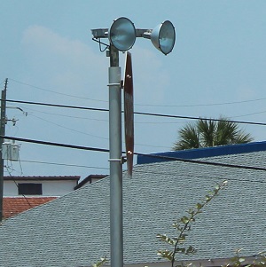 Yes, that’s a STOP sign with two spotlights mounted on top that are pointed directly at oncoming drivers. They produce enough glare to completely blind drivers, making the STOP sign all but invisible. By all indicators, this could qualify as the Least-Safe STOP Sign in America!
Finally, I present to you an old example from the files of the International Dark Sky Association. I’m told that this photo shows a lighting installation (that’s thankfully since been fixed) at a professional astronomical observatory.
 So what’s wrong with this picture? Plenty! At night when someone approaches the door, they will get a heavy dose of glare and then step into total darkness just as they need to negotiate the step and the door. Here’s yet another example of a light creating an unsafe situation.
All too often people don’t think carefully about what a light is supposed to accomplish. With a little education and some consideration, all examples of bad lighting across the globe could be fixed in our generation. Imagine all the improvements in safety, energy savings and our views of the night sky that we would enjoy if it came to pass.
 W. Scott Kardel is the Managing Director of the Tucson, Arizona based International Dark-Sky Association, a nonprofit dedicated to preserving the night sky and educating the public about outdoor lighting. Scott much prefers good outdoor lighting and works to help people put it into place.


